Logo & Wordmark
- Light: Use this version with a white or light backgrounds.
- Dark: Use this version with a dark or brand-colored backgrounds.
- Black: Use this version with a black and white print or single-color applications.
- White: Use this version with a dark backgrounds where color is not permitted.
Logo
The logo is a version of the logo that does not include any text or company name. It should be used in contexts where the brand is already well-known, or where space is limited, such as on social media profile pictures, favicons, or small merchandise items. Ensure that this logo maintains its integrity and is easily recognizable even without the accompanying text.
Primary - Logo - Light
Primary - Logo - Dark
Monochrome - Logo - Black - Black
Monochrome - Logo - White
Wordmark
The wordmark is a version of the logo that includes the company name in a stylized font. It should be used in contexts where brand recognition is important, such as on marketing materials, websites, and social media profiles. Ensure that the wordmark is legible and maintains its integrity across different sizes and backgrounds.
Primary - Wordmark - Light
Primary - Wordmark - Dark
Monochrome - Wordmark - Black
Monochrome - Wordmark - White
Audience
Mission Statement
CloakedCyber is dedicated to providing knowledge and security, all through our mascot, Locky. Through our work, we hope to make the digital world more digestible. Bring a childlike wonder to cybersecurity.
Audience Considerations
- We will build our platform for the general public. To ensure people unfamiliar with and confused about cybersecurity are not left behind.
- We will provide a physical path wherever it is within our means, so that our users can access and understand cybersecurity concepts.
- We will ensure that our content is accessible to users through audible and visible means.
Voice & Language
Brand Voice
CloakedCyber's outwards voice and tone should be set in a fantasy-inspired style around Locky protecting his tower, making clear the metaphorical connection to making cybersecurity seamless and intuitive.
Plain Language Guidelines
CloakedCyber's programs and educational materials should be written at a 6th-8th grade reading level, using clear and concise language. Avoid technical jargon where possible, while still maintaining security, clarity, and accuracy.
Colors
Brand Palette
Color Usage Policy
Locky and CloakedCyber is a black and white brand. Through we use orange, symbolizing innovation. We do not rely on our accent color nor should any color alone be used to convey meaning or information.
Text Contrast Playground
When creating new design assets, the create should aim to create within our dark or light asstechic. If you must devaent from the palette slightly ensure to use sufficient contrast as seen in action on this page. Use a contrast checker tool like the one below to verify your color choices. Making sure they meet WCAG 2.1 AA standards while aiming to meet AAA standards.
- WCAG AA: Requires a contrast ratio of at least 4.5:1 for normal text and 3:1 for large text.
- WCAG AAA: Requires a contrast ratio of at least 7:1 for normal text and 4.5:1 for large text.
Preview Text
The quick brown fox jumps over the lazy dog.
Contrast Ratio:
| Standard | Normal Text | Large Text (18pt+ / 14pt bold) |
|---|---|---|
| WCAG AA | ||
| WCAG AAA |
Negative Examples
The following examples illustrate color combinations that fail WCAG AA compliance due to insufficient contrast.
Do Not Use
Light gray text on white background (Fails WCAG AA)
Do Not Use
Black text on dark gray background (Poor visibility)
Non-Text Contrast (UI Elements)
For UI elements these are element like borders, buttons, and icons, it is required that they follow the minimum contrast ratio. This ratio is 3:1 against their background, use the methods explainded above to determine if the contrast is sufficient.
Inline Links
Inline links should not just be visually distinct in color but also in their presentation. Underlined inline links are recommended for accessibility.
- Text Decoration should be used to define inline links with underlines.
- Color Contrast is important to inline links too. They must meet a 4.5:1 contrast ratio against their text and meet the same requirements as normal text.
- Hover & Focus should be clearly visible and distinguishable from the default state. This means a change of color to the ratio of 3:1 against it's past state along with a 2px border or background.
Typography
Typeface Selection
Headings: Lato
Body Text: Victor Mono Variable
Readability Standards
- Line Height: Body text must have a line height of at least 1.5 to ensure readability.
- Paragraph Spacing: Spacing between paragraphs must be at least 2 times the font size.
- Alignment: [Define your rules regarding text alignment and justification for readability]
- Capitalization: [Define your rules regarding the use of ALL CAPS text]
Hierarchy Preview
Heading 1 (H1)
size 1.3 em to 2.5 em, weight of 400
Heading 2 (H2)
size 1.5 em to 2 em, weight of 400
Heading 3 (H3)
size 1.17em to 1.5 em, weight of 400
Body text is 16px set as and by 1em, in all our digital these are the ranges to follow.
In the high tower of CloakedCyber, the wizard Locky stands watch, staff glowing with protective runes as he guards the realm from unseen digital threats. With simple, clear spells, he transforms confusing cybersecurity magic into lessons anyone can wield. Sealing weak gates, strengthening secret passphrases, and keeping every traveler’s data treasure safe from the shadows beyond the walls.
Imagery
Multimedia Policies
- Text in Images, is not to be used. It is not possible to be read by screen readers and can easily fail to be readible in size changes. In the case of ads, posters, and other print being redisplayed un web give a breif description in alt text.
- Video & Audio, clear and accurate captions and transcripts provided for all video and audio content. Captions should be able to give a full description of the audio content. This includes things like giving a brief but real explanation of music and sound effects.
- Motion Control, controls over all interactive elements and motion should be available to users. This includes providing options to pause, stop, and reduce motion. Blinking or flashing content should be avoided. If used should be limited to 3 flashes a second.
Alt-Text Style Guide
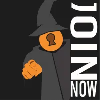
Alt-Text: " ", remember when using decorative imagery to use a single space in the alt text. This is so that the image is skipped by screenreaders.
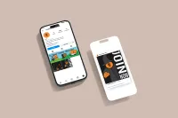
Alt-Text: "iPhone mockup, showing off what would appear on our instagram page."
UX & Content Design
Visual UI States
Text Links
Links must be distinguishable by more than just color. Default: Underlined.
This is a paragraph containing a text link to demonstrate the default state.
Button States
Buttons must have a highly visible focus indicator (e.g., outline) for keyboard navigation.
Touch Targets
Interactive elements must have a target size of at least 44x44 CSS pixels to accommodate touch inputs.
Structure & Semantics
- Form Labels: [Define your policy on form labeling, including the use of placeholder text vs. persistent labels]
- Heading Structure: [Define your rules for using semantic heading tags (H1-H6) to structure content]
Implementation
Approved Accessibility Tools
- [Tool 1: e.g., Contrast Checker]
- [Tool 2: e.g., Evaluation Tool]
- [Tool 3: e.g., Screen Reader]
Pre-Flight Audit Checklist
Before publishing any digital asset for [Brand Name], designers and content creators must verify the following: